State Bank of India (SBI) is a public sector multinational banking and financial, statutory body. It is the 43rd largest bank in the world. In 2020, it was ranked 221 in the Fortune Global 500 list of the world’s biggest co-operations. It has over 24,000 branches all over India, making it India’s largest bank.
SBI has grave importance in building our nation. Established in the 19th century during British colonialism, its initial name was the Imperial Bank of India. Later, in 1955 it was changed into a public sector bank and was given its name known today.
Just like SBI, its logo has also been through a fascinating journey. We have laid down the memorable journey of this simplistic blue logo of SBI that everyone loves.
So, let us take you through the captivating journey of the SBI logo.
The logo below was the Imperial Bank of India logo before turning into the State bank of India in 1955. However, this logo is not enlisted in the list of SBI official logos over the years. Still, it plays a significant part in developing the initial logo of SBI.

The First Logo Of SBI
The first logo of SBI was introduced in 1955, along with establishing the public sector bank. It depicted a giant banyan tree which signified the strength it withholds as a bank. The large branches of the tree growing all over depicted perseverance, progress, and growth of SBI.
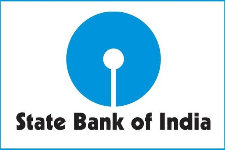
State Bank Of India Now
Along with time, SBI grew into an influential and trustworthy bank. And during all this, the public witnessed new ideas, new achievements, and a new Logo. A more simplified but quite memorable logo. Today’s blue logo is designed by Shekhar Kamat from the National Institute of Design, Ahmedabad. It was announced on 1st October 1971, with the SBI Central office building opening at Backbay Reclamation Bombay.

Though, the story doesn’t end here. The blue logo, with a small circle in the middle and a radius, cut all the way to the bottom, has made people wonder about it. During the time, many interpretations have developed for the logo.
1. The first and most convenient interpretation of the logo suggests that the small circle and white vertical line form a keyhole, which symbolises safety and assurance.

2. It is also said that the center circle represents SBI itself and the white line touching it denotes towns and cities. Altogether, it says that SBI is everywhere to serve you.

3. Another interpretation is that the big blue circular form of the logo depicts unity and completeness. And the white part represents a small person who is a significant part of the bank.

4. The small white circle is also interpreted as a stone thrown in a circular pond, which denotes a small deposit leading to giant waves, where waves depict growth.
5. One interesting interpretation is that the designer Shekhar Kamat took inspiration from the Kanakaria Lake in Ahemdabad. Though it may not be entirely correct, the resemblance is hard to overlook.
Read more: IPS Officers Responsibility, Power And The Perks They Enjoy